JTB Americas
Year
2017
Location
Los Angeles, USA
Deliverables
- Brand Strategy
- Brand Identity
- Brand Guidelines
- Web Design & Development
- Marketing Collaterals
- Event Design
Background
The largest Japanese travel bureau JTB Japan reached out to us to rebrand one of their existing companies in Los Angeles, TPI America. They were in dire need of a new brand identity because everyone in the company felt that the existing one was outdated and wasn’t representing the company values in the right way. Travel Plaza International (TPI) is a tour operator and offers products, services and local operations to B2B wholesalers across the world.

Brand Strategy
There were several layers of decision-makers involved on the client side, so we decided to organize a 2-day brand workshop in Los Angeles to align everyone’s vision and provide brand clarity. The idea of the workshop was to clearly identify the company’s brand attributes and product language, and to figure out how and where the brand should be positioned in the market.
Colour Palette
The unconventional yet dignified array of colours – a warm Coquelicot against colder dark Purple Taupe – is designed to appeal to an adventurous audience and to add a friendly and lively, yet distinguished touch to printed materials and digital designs. While the warm shade of red stands for care, passion and friendliness, the dark grayish magenta stands for professionalism, expertise and elegance. The logo, however, does not depend on colours and can be equally as effective in black or white.
Coquelicot
#de3831
Purple Taupe
#272445
Pure Black
#000000
”The Titans became a vital part of our organization and have been supporting us for many years. They helped us create a brand that worked and that all employees were really proud of.
Jeff TanoJTB Americas - Managing Director
Brand Identity
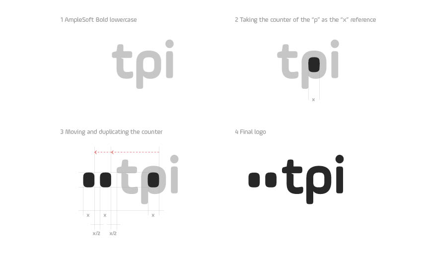
The TPI brand system is based on the aspect of travel and features round shapes that create a friendly and approachable look. Look through the TPI window that is featured in the logo and you will discover beautiful places and make new unforgettable memories. The logo itself features a continuous line of windows like the side of an airplane.
This mnemonic element is used throughout most of the communication and helps to strengthen the overall identity.
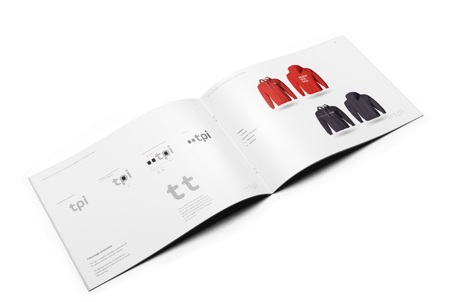
Brand Guidelines
We have established brand guidelines that includes rules for logo usage, colours, typography, photography, event designs, print materials, and much more. The guidelines grew to a 100+ page document over the past few years.


